> ## Documentation Index
> Fetch the complete documentation index at: https://docs.superun.ai/llms.txt
> Use this file to discover all available pages before exploring further.

# 生成移动响应的变体

## 场景

您设计了一个桌面页面,但现在您还需要一个移动布局.

## 挑战

手动将大屏幕转换为响应式移动设计需要时间
（间距,堆叠,调整大小,组件调整）.

## 如何让 prompt.to.design 提供协助

* 选择您的桌面Frame或准备您的桌面图片
* 输入移动转换提示
* 单击**生成**立即生成重排的移动布局
* 该插件自动重组布局,调整间距,并确保触摸友好的可用性
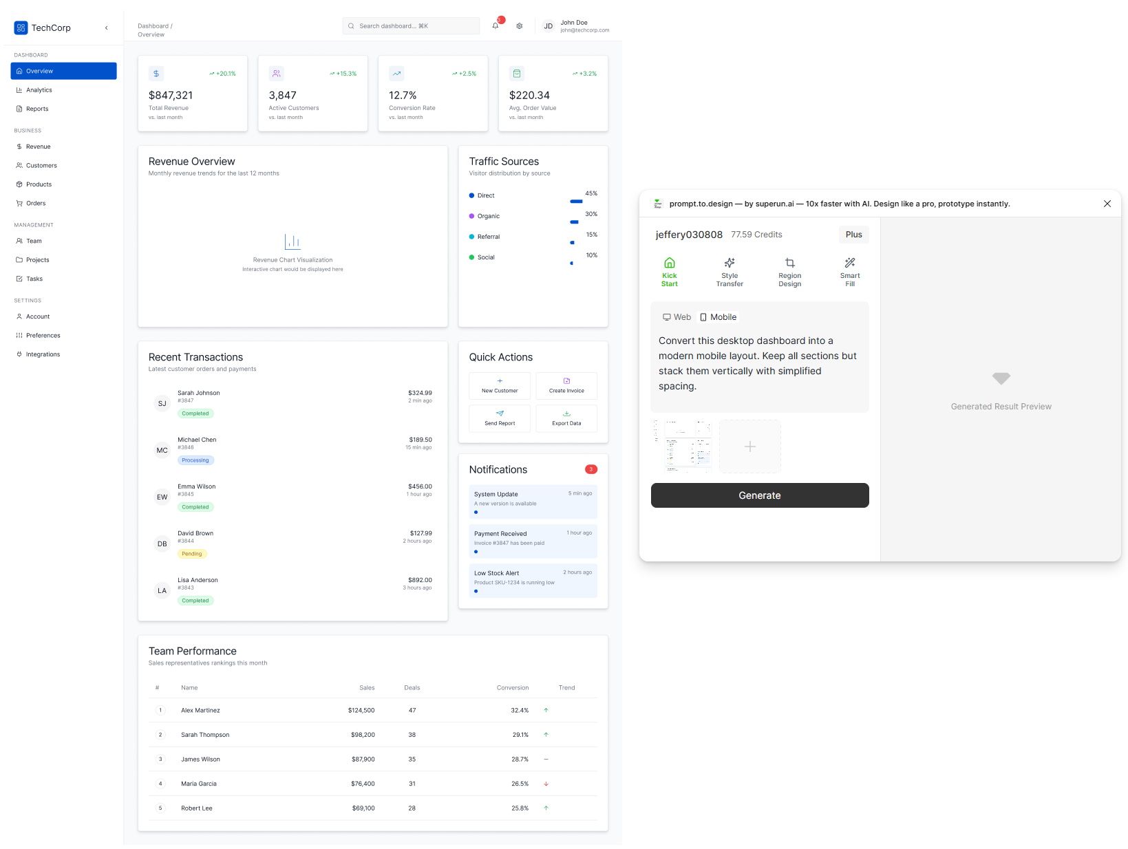
<img src="https://mintcdn.com/uxarts/UM9wkb-xhueNg0Cg/images/convert-mobile/1.png?fit=max&auto=format&n=UM9wkb-xhueNg0Cg&q=85&s=65b31f58ecbd1c2238c9b5410f7d0467" alt="Desktop frame selected and mobile conversion prompt entered" style={{ marginTop: '1rem', borderRadius: '8px' }} width="1639" height="1234" data-path="images/convert-mobile/1.png" />

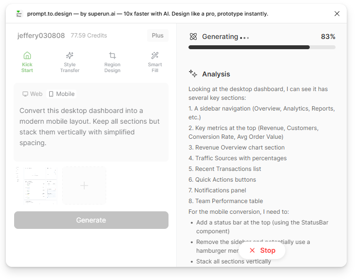
* Generation begins. The right panel shows prompt.to.design’s analysis of layout structure, spacing rules, and mobile adaptation logic.
<img src="https://mintcdn.com/uxarts/UM9wkb-xhueNg0Cg/images/convert-mobile/2.png?fit=max&auto=format&n=UM9wkb-xhueNg0Cg&q=85&s=03e047909026df5865174f9b9dfbe267" alt="AI analysis for mobile conversion" style={{ marginTop: '1rem', borderRadius: '8px' }} width="731" height="575" data-path="images/convert-mobile/2.png" />

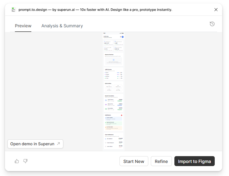
* 查看生成的移动布局,如有必要进行完善,或**导入到 Figma**

<img src="https://mintcdn.com/uxarts/UM9wkb-xhueNg0Cg/images/convert-mobile/3.png?fit=max&auto=format&n=UM9wkb-xhueNg0Cg&q=85&s=73562a9694f7f7ab6a0730f76571eafb" alt="Preview of mobile layout output" style={{ marginTop: '1rem', borderRadius: '8px' }} width="738" height="567" data-path="images/convert-mobile/3.png" />

***

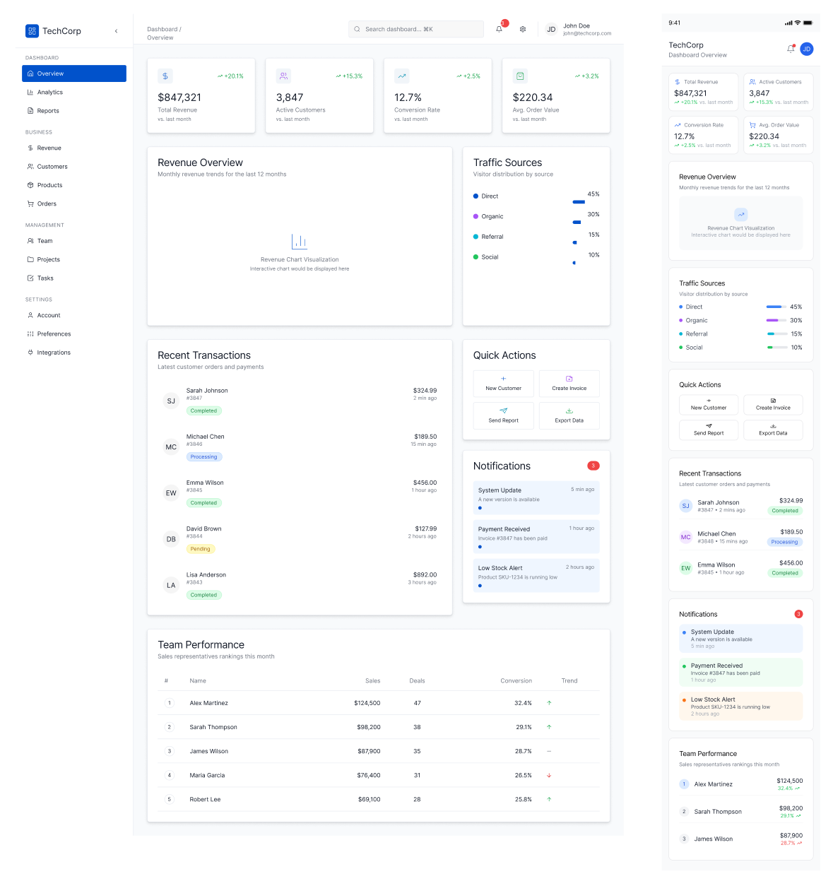
## ✔ 您的桌面设计变成干净,响应灵敏的移动布局 - 无需手动重建整个屏幕
<img src="https://mintcdn.com/uxarts/UM9wkb-xhueNg0Cg/images/convert-mobile/4.png?fit=max&auto=format&n=UM9wkb-xhueNg0Cg&q=85&s=56bc0796171ee2087e13da233721f730" alt="Desktop vs mobile layout comparison" style={{ marginTop: '1rem', borderRadius: '8px' }} width="1179" height="1254" data-path="images/convert-mobile/4.png" />