> ## Documentation Index
> Fetch the complete documentation index at: https://docs.superun.ai/llms.txt
> Use this file to discover all available pages before exploring further.
# Generate mobile-responsive variations
## Scenario
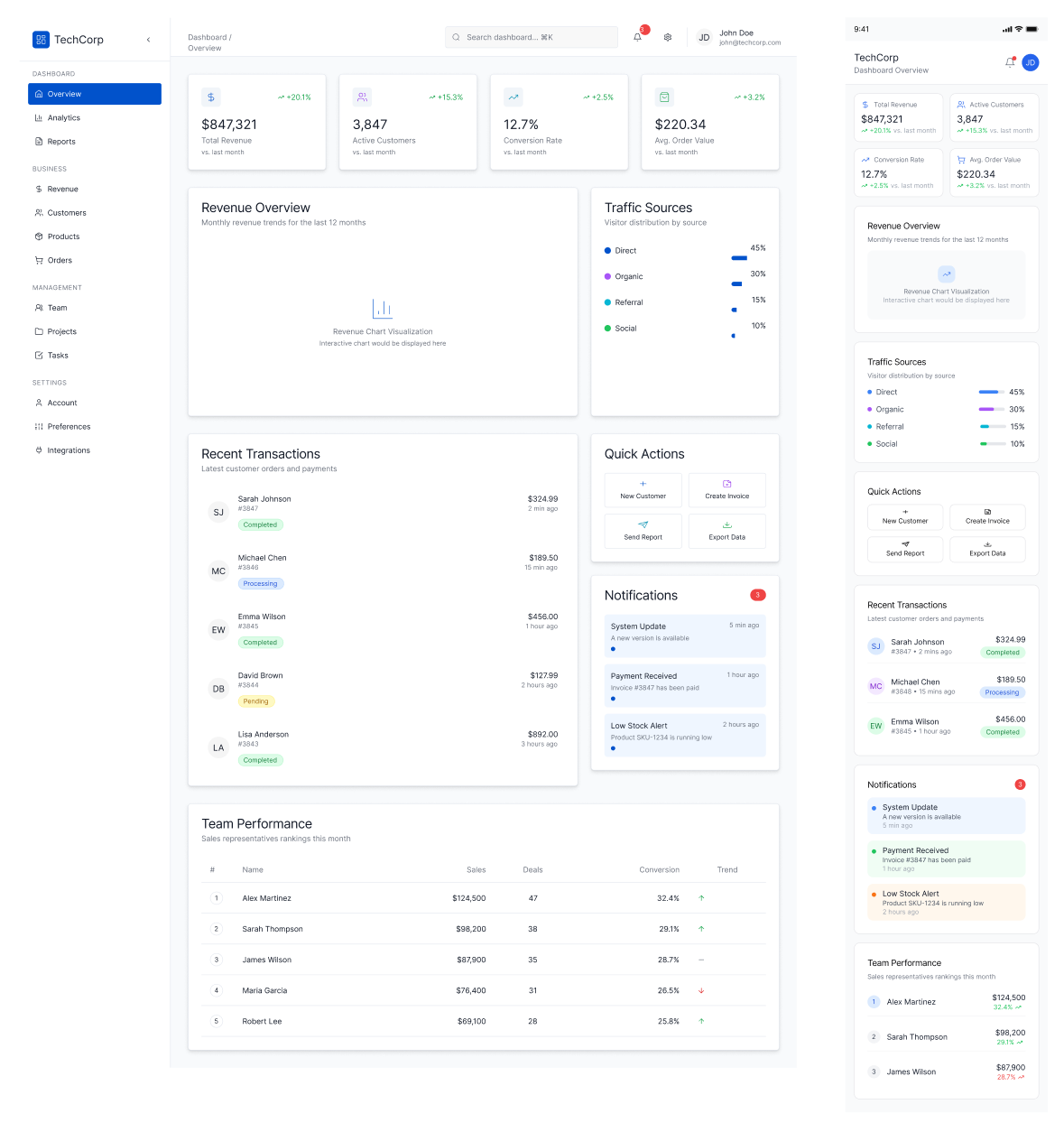
You designed a desktop page, but now you also need a mobile layout.
## Challenge
Manually converting large screens to responsive mobile design takes time\
(spacing, stacking, resizing, component adjustments).
## How prompt.to.design helps
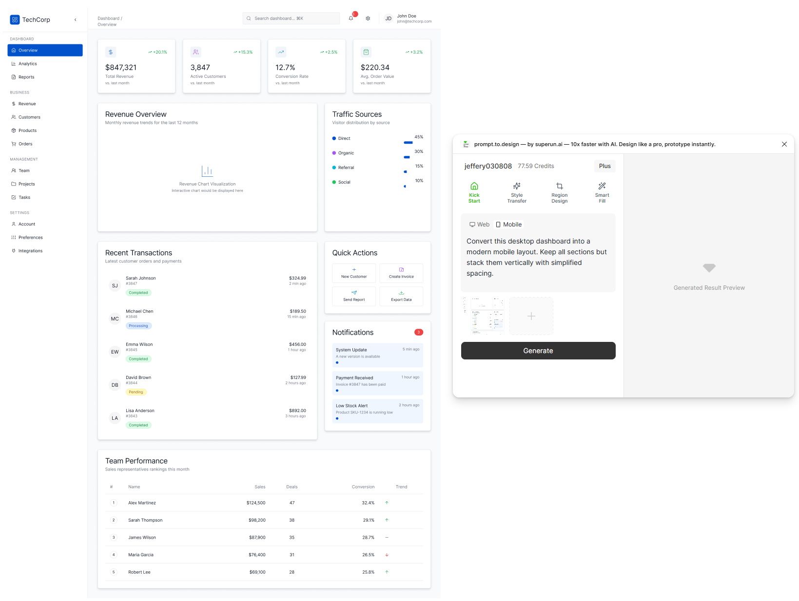
* Select your desktop frame or prepare your desktop picture
* Enter a mobile conversion prompt
* Click **Generate** to instantly produce a reflowed mobile layout
* The plugin automatically restructures layout, adjusts spacing, and ensures touch-friendly usability
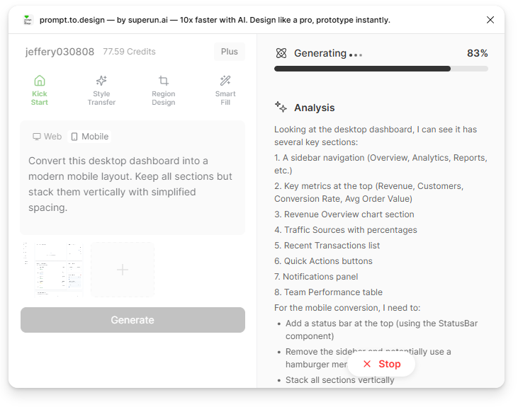
 * Generation begins. The right panel shows prompt.to.design’s analysis of layout structure, spacing rules, and mobile adaptation logic.
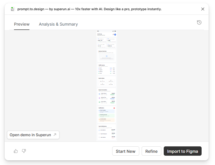
 * Review the generated mobile layout, refine if necessary, or **Import to Figma**
 ***
## ✔ Your desktop design becomes a clean, responsive mobile layout — without manually rebuilding the entire screen
***
## ✔ Your desktop design becomes a clean, responsive mobile layout — without manually rebuilding the entire screen